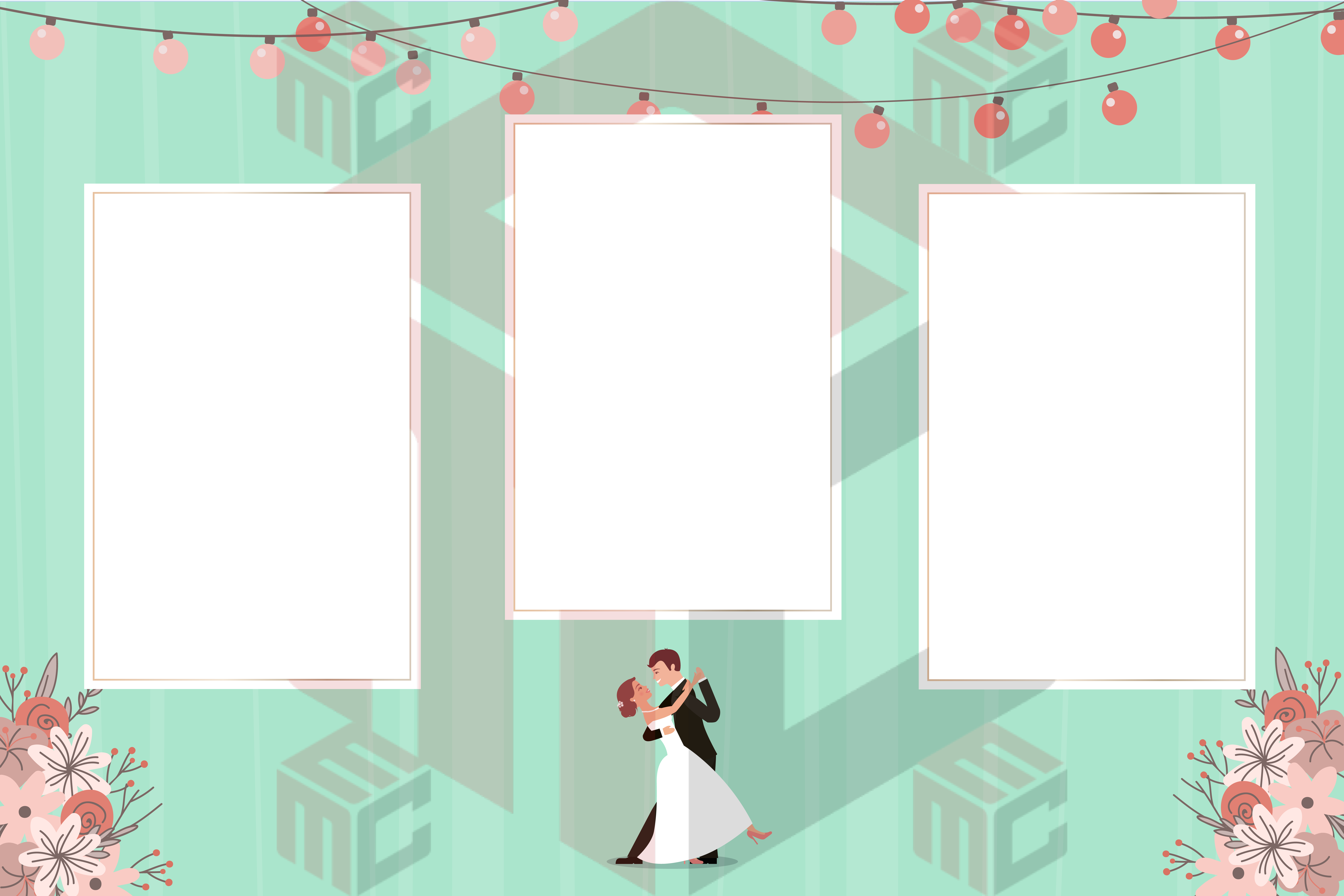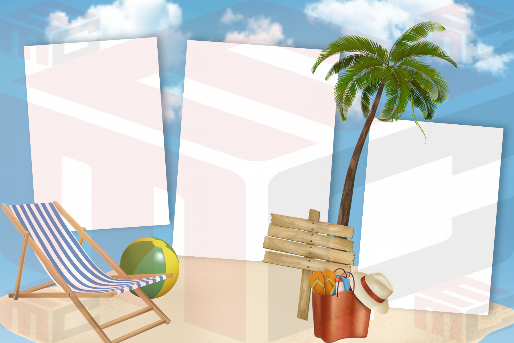
Choosing a photo booth template by color alone can create problems later. The design also needs to match the event mood, guest groups, booth capture sequence and printer output. A template that looks perfect in a gallery can still be the wrong choice if its photo openings do not fit the booth or its decorative style fights with the event.
Define the event in a few practical words
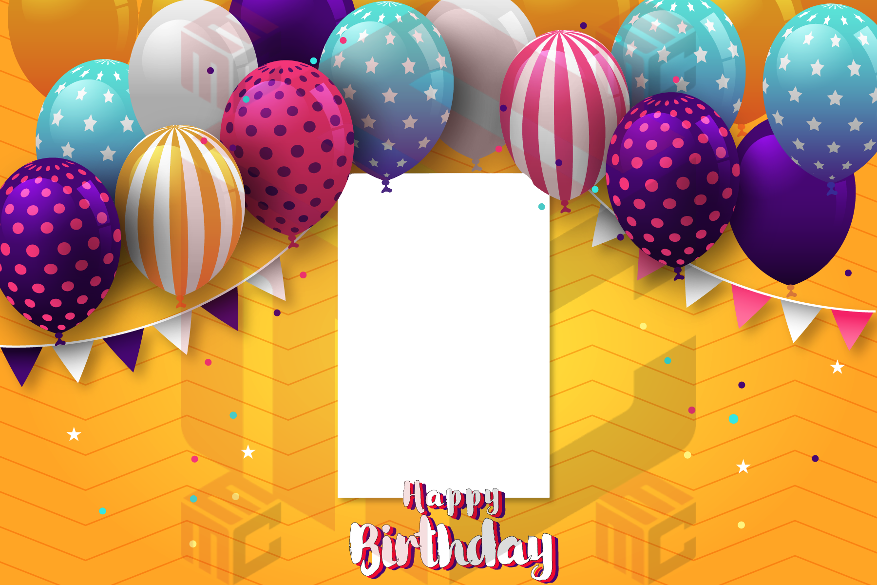
Before browsing, describe the event with three or four useful terms: formal wedding, playful birthday, branded corporate gala, luxury Quinceañera, winter holiday party. These words help eliminate designs that may be attractive but wrong for the client. Ask for the invitation, event colors or mood board when one exists.
Choose the photo layout before the decoration
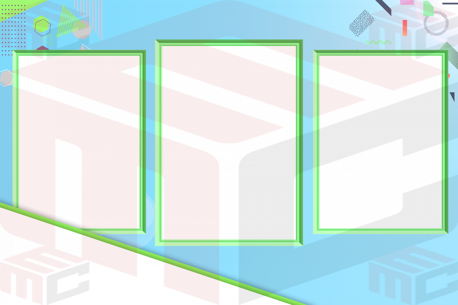
Confirm whether the booth needs one, two or three photographs, a strip or a larger print. Check portrait versus landscape orientation and the actual printer output. Only then should you choose among visual styles. The photo booth templates library contains many looks, but the correct photo-slot geometry should be your first filter.
Match the energy of the event
A formal reception usually benefits from restrained decoration and strong typography. A child’s birthday can support brighter color and playful graphics. Corporate events may need brand space. Graduation prints often require a class year or school name. Themed events such as Halloween or New Year’s Eve can handle more dramatic artwork because guests expect a strong visual cue.
Check whether the design works with real guests
Imagine the people who will actually use the booth. Will families pose together? Will guests wear hats or hold props? Are large bridal-party groups expected? A beautiful border can become a problem if it leaves too little room for heads and shoulders. Test the template with representative photographs, not only empty placeholders.
Use the client’s wording sparingly
Names, event date and a short event title are usually enough. Longer copy makes a small print feel crowded. Confirm spelling before final approval and keep editable text separate from decorative artwork whenever the editor allows it. That makes last-minute changes much safer.
Print before you approve
View the design at actual size and run one sample through the real printer. Check text readability, border alignment, crop behavior and trim. Colors on a monitor can look different on paper, especially dark backgrounds, pale pastels and metallic effects.
Build a shortlist instead of starting over
Operators who maintain a few reliable starting layouts for weddings, birthdays, corporate events and seasonal bookings can respond to clients much faster. MyMirrorClub’s library makes it possible to compare event-specific designs, then customize the strongest choice rather than rebuilding the print for every inquiry.
Start with the main MyMirrorClub photo booth template library, then narrow the selection by event type, photo count and orientation before making cosmetic changes.